What to put in an OG image so the right people click
An OG image is the picture that shows up when someone shares your link. With the title and description beside it, it tells people what the page is before they click. So it decides who clicks, not only how many.
In this piece
Put 3 things in your OG image and the tags around it: what the page is, what the reader gets, and who it's from. Keep all 3 true to the page. That's how the right people choose to click.
The OG image is one of the most overlooked parts of a website I see with the businesses I work with. Here's what I put in one, and the check I run before any card goes live.
What is an OG image, and where does it show up?
It's the picture that appears when someone shares your link. You'll also hear it called a social share image or a link preview image. OG stands for Open Graph, a set of tags hidden in your site's code. The Open Graph protocol lists 4 required tags, and says the image “should represent your object.” In plain words, the picture should stand for what you published.
The image rarely travels alone. Beside it sit the share title and the share description. Together they make the preview.
Here's this post's own preview, laid out the way 4 apps show a shared link.
LinkedIn and Facebook build their previews from these tags. Slack reads them alongside X's own tags. Apple's Messages app reads them too. So this little box is often the first thing anyone sees of your work. People meet it before they meet your site, and it tells them the subject, the tone and how much care went in.
Why does the preview matter before the click?
Because it's a promise, and whatever sits behind the link has to keep it.
Nielsen Norman Group makes this point about links on a web page, in a piece called A Link is a Promise. Its line is simple: “Any broken promise, large or small, chips away at trust and credibility.” They wrote it about link text, not share cards. I think it applies even more to a share card, because it's the first thing a stranger is told.
A vague or mismatched card can cost you more than the click. It can bring in the wrong reader with the wrong expectation. They leave, and your content takes the blame for something the preview said.
A clear card helps the right people choose to click.
The people it's meant for see themselves in it. The people it isn't for scroll past. That's the trade-off, though. An accurate card can earn fewer clicks than a vague one. I'll take that, because a visit from the wrong reader only looks like interest.
What should you put in an OG image?
For a homepage or a service page, here's the template I use:
- Your logo, top left.
- One line that says what the page is.
- One line on what the reader gets.
- A short tagline and your domain along the bottom.
- 1200 x 630 pixels, with room around the edges so nothing gets cut off.
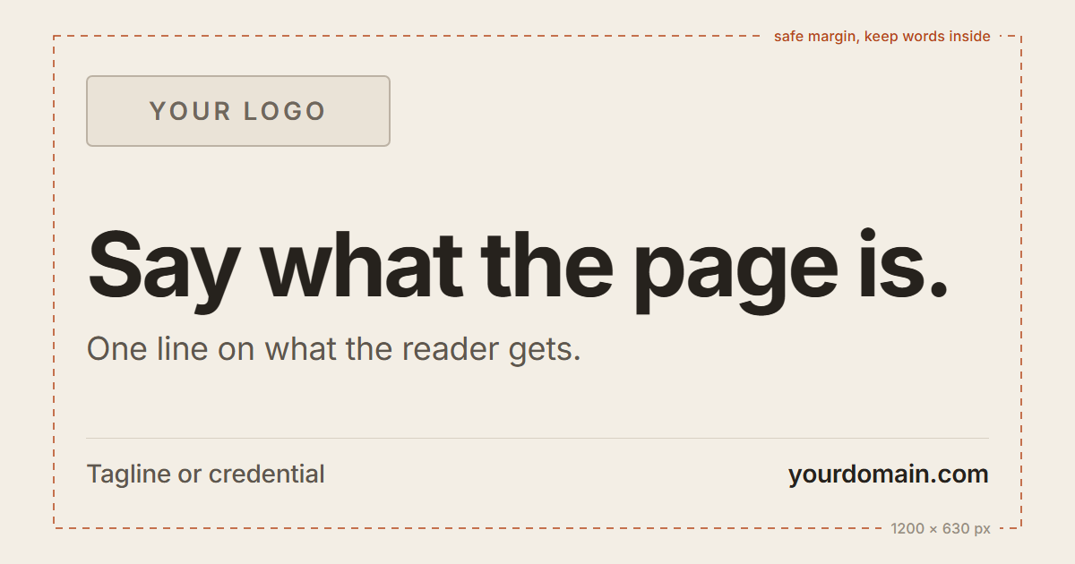
The size isn't random. Meta asks for images of at least 1200 x 630 pixels, as close to a 1.91:1 ratio as possible, so the full image shows in Feed without cropping. LinkedIn's help pages ask for the same 1.91:1 ratio. That wide shape is the one to design for.
Each part of the preview has one job. Here's how I keep each one honest.
| Part | Its job | Keep it true by |
|---|---|---|
| Share title | Say what the page is | Echoing the headline |
| Share description | Say what the reader gets | Mirroring your opening paragraph |
| OG image | Show the subject and the care | Fitting the topic and design |
Should an OG image have words on it?
It depends on the page.
A homepage card has a selling job. It says who you are and who you help, and one big line earns its place there.
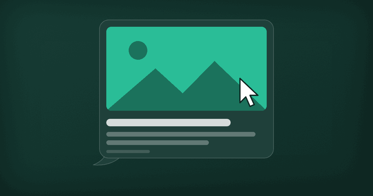
A blog post is different. The share title and description already carry the words, so I make the card one picture of the topic. No title, no logo. The card for this post is a link preview inside a chat, with a cursor about to click.
Apple goes further than I do. Its guide to rich previews in Messages says: “Avoid text in preview images.” Previews show at different sizes on different devices, so small words can end up unreadable. It also asks for images at least 900 pixels wide.
That's the fair case against the template above. If you keep words on a homepage card, keep them few and big. Words baked into pictures cost you in other ways too, and I've written about why text in images costs more.
How do you check a share preview before it goes live?
Before I publish, I check how the link renders where it'll actually be shared. Big and small.
- Paste the link where it'll be shared: LinkedIn, X, iMessage, Slack.
- Look at the wide card at full size, then the way it shows on a phone. The main line has to read small.
- Stress-test the edges. I crop a centered square out of the wide card. If the words survive that, they'll survive a tighter preview.
- Read the card, then the first screen of the page. Do they say the same thing?
- If a platform shows an old version, refresh it. LinkedIn's Post Inspector and Facebook's Sharing Debugger both do this.
I ran my new homepage card through that check before it went live. Two things didn't hold up.
The wide card looked fine. The stress test didn't. On a square crop, “Marketing strategist” turned into “keting strateg.” The headline ran almost edge to edge, so the crop took letters off both ends.
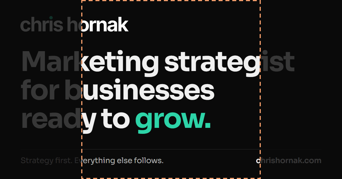
The fix isn't a second, square image. Open Graph lets a page list more than one, but the first one gets preference, so design for the wide card and keep the words away from its edges.
The second problem was quieter. The card promised “grow.” The page opens with “get found.” Both are true about my work. But someone who clicked for growth would land on a page about being found, and that's a small broken promise.
Neither problem jumps out when you look at the card on its own. It took the check to catch both.
My free Findability Check covers the technical half. It looks for a share title, description and image, and tests that the image address actually loads. It can't tell you whether the card keeps the page's promise. That part is still a human read.
Paste a link into my free Open Graph Checker. It measures your image, runs the square crop test and shows your link in 4 apps and Google, with the source for every rule.
Check your linkWhen does the OG image matter less?
On pages that rarely get shared. A checkout or a login screen needs a sensible default, not a custom design.
When the content is weak. A clear card brings the right reader in. It can't make the visit worth their time.
And right after you change it. Meta's sharing guide says images are cached by their address and won't update unless the address changes. So I save each new card under a new file name.
One question
Text your homepage link to yourself. Look at the card before you tap it.
Does it promise what the page delivers?
The Open Graph Checker shows your card the way 4 apps and Google do, flags what's off and hands you the tags to fix it. Free, no sign-up.
Check your linkQuestions people ask
What should an OG image include?
Something that stands for the page. For a homepage or service page, that is your logo, one line on what the page is, one line on what the reader gets, and a short tagline with your domain. For a blog post, one picture of the topic can be enough, because the share title and description already carry the words. Whatever you use, it should make the same promise as the page.
What size should an OG image be?
Use 1200 x 630 pixels. Meta asks for at least 1200 x 630 pixels and a ratio as close to 1.91:1 as possible, so the full image shows in Feed without cropping. LinkedIn recommends the same 1.91:1 ratio, and Apple asks for images at least 900 pixels wide for previews in Messages.
Should an OG image have text on it?
It depends on the page. A homepage card can carry one short, large line that positions the business. On a blog post, the share title and description already carry the words, so a picture works better. Apple’s guide to rich previews in Messages says to avoid text in preview images, because previews show at different sizes and small words can become unreadable.
Why is my old OG image still showing?
Platforms cache previews. Meta says images are cached by their URL and will not update unless the URL changes, and LinkedIn says a preview may show an old cached image. Save a new image under a new file name, then refresh the preview with LinkedIn’s Post Inspector or Facebook’s Sharing Debugger. Posts that already went out keep their old preview.